Visual Unit Workshop
Work to have done: a solid attempt at a complete visual argument, ideally meeting baseline criteria. Rough edges are still welcome.
Plan for the day:
- Workflow Reminder: Describe -> Evaluate -> Suggest (5 min)
- Evaluation reminder: our shared criteria (5 min)
- Peer Review Workshop (3 times 10-12 min)
- Evaluation revisited (10 min)
- HW Preview
Heads up: Important note about file types and non-GIMP users
Several of you had asked about the possibility of working with Photoshop or Illustrator, which I said was fine as long as it matched your career goals. However, that does throw a potential wrench into workshop plans, I've just realized: everyone needs to be able to open each other's files.
SOLUTION FOR GIMP USERS:
Luckily, GIMP can open .psd (Photoshop) and .ai (Illustrator) files. So in that direction, we should be fine – GIMP-users, you just need to know to look for one of those two file extensions.
SOLUTION FOR NON-GIMP USERS:
Unfortunately, I believe that Photoshop can not open an .xcf file. Therefore, the best way to see your partners' drafts is to please make sure you have a copy of GIMP installed before today's class – even if you're working with another program for this project.
BACKUP "SOLUTION" FOR EVERYONE:
As a failsafe, everyone should make sure your repos include an exported flat image (.png) and take a screenshot of the most current version of your project. That way, even if the rich, layered version isn't working, your partners will at least have something to look at.
Thanks, and sorry about the lateness of this realization!
1. Workflow Reminder: Describe -> Evaluate -> Suggest (5 min)
Like last time, I’d like you to use a workflow that, first and foremost, helps you see what’s already happening.
It takes practice; not all of you were really using it last time (though some were! Thanks!). Please do try: it helps make your comments more concrete and actionable. It’s great to like something, but if you can’t say what you liked, the creator can’t build on that knowledge as effectively… and you may not be learning as much as you could by naming what you value.
A good test is whether you can tell, just from your comment, what you were reacting to.
To help maximize what you learn both in receiving and in giving feedback, please work in the following three steps:
- First describe what you see. Where do your eyes go first? What do you think is the main point your partner wanted to get across?
- Then evaluate where it meets or misses our shared criteria. NB: This is still a form of description: it's not about "good" or "bad" in the abstract but about where it meets or misses the shared or stated goals.
- Finally, suggest ways to meet and exceed the criteria. Let's try to help everyone get at least to baseline! NB: The idea is suggestion, not commands: aim for a friendly tone. (And remember to also interpret these that way, whatever their tone.)
2. Evaluation reminder: our criteria (5 min)
After last class, I integrated your suggested goals and constraints in our notes doc. Let’s just look at these together briefly, to make sure there are no surprises. Baseline criteria For a minimum grade of B, all projects for this unit must:
- Guide viewers’ attention using at least one design strategy among Dominance & Hierarchy (strong contrasts), Positive/Negative space, or Rhythm & Movement
- Have a clear message or intervention that you can articulate
- If including words, choose a font that matches the style/tone of your piece
- If not using words, clarify your message and this choice in the reflection
- For all of the above, explain your choices in the reflection
- Use at least 3 layers
- Use at least 1 tool beyond select, move, and text
- Credit all assets correctly, including attribution (creator names) where required
Aspirational inspirations To target (but not guarantee) a grade above a B, the best projects for this unit may…
- Use multiple design strategies in ways that compliment each other (whether to reinforce a single shared focus or to add nuance / surprise down the hierarchy)
- Have a clear message/focus that others can articulate without your text (as shown in their feedback)
- Use more than 3 tools beyond select, move, and text that are new to you
- If using multiple fonts, use fonts that pair well (refer to readings)
- Organize the canvas toward simple, minimalist design (slogan/headline, not paragraphs)
- Organize your files through layer labeling, layer groups, repo structure
- Use meaningful commit messages that say what’s changing (and maybe even why)
3. Peer Review Workshop (3 times 10-12 min)
Updated GitHub instructions, based on last time’s pitfalls and solutions!
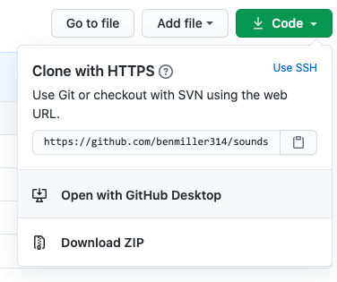
- Go to your first partner’s website, and use the green “Code” button – but instead of cloning, download the zip file.

- should be faster than cloning, because it leaves out the history of changes (but you can find it on GitHub)
- shouldn’t cause conflicts with your own repository
- still, you may want to add your partner’s name to the zip file, just to be safe
-
Unzip the folder to view the files. (Windows users have the option of viewing the contents of the compressed folder, but it’ll work better if you decompress first.) Start with the .xcf (GIMP) file, or – if your partner’s not using GIMP – the .psd (Photoshop) file.
- Here’s where the cycle really starts:
- describe the visual argument you see. What seems to be the top-level focus? What’s next in the hierarchy? Can you say back the argument/claim/intervention?
- _evaluate the project relative to the shared set of criteria, and
- suggest changes that you think would take it to baseline and/or above.
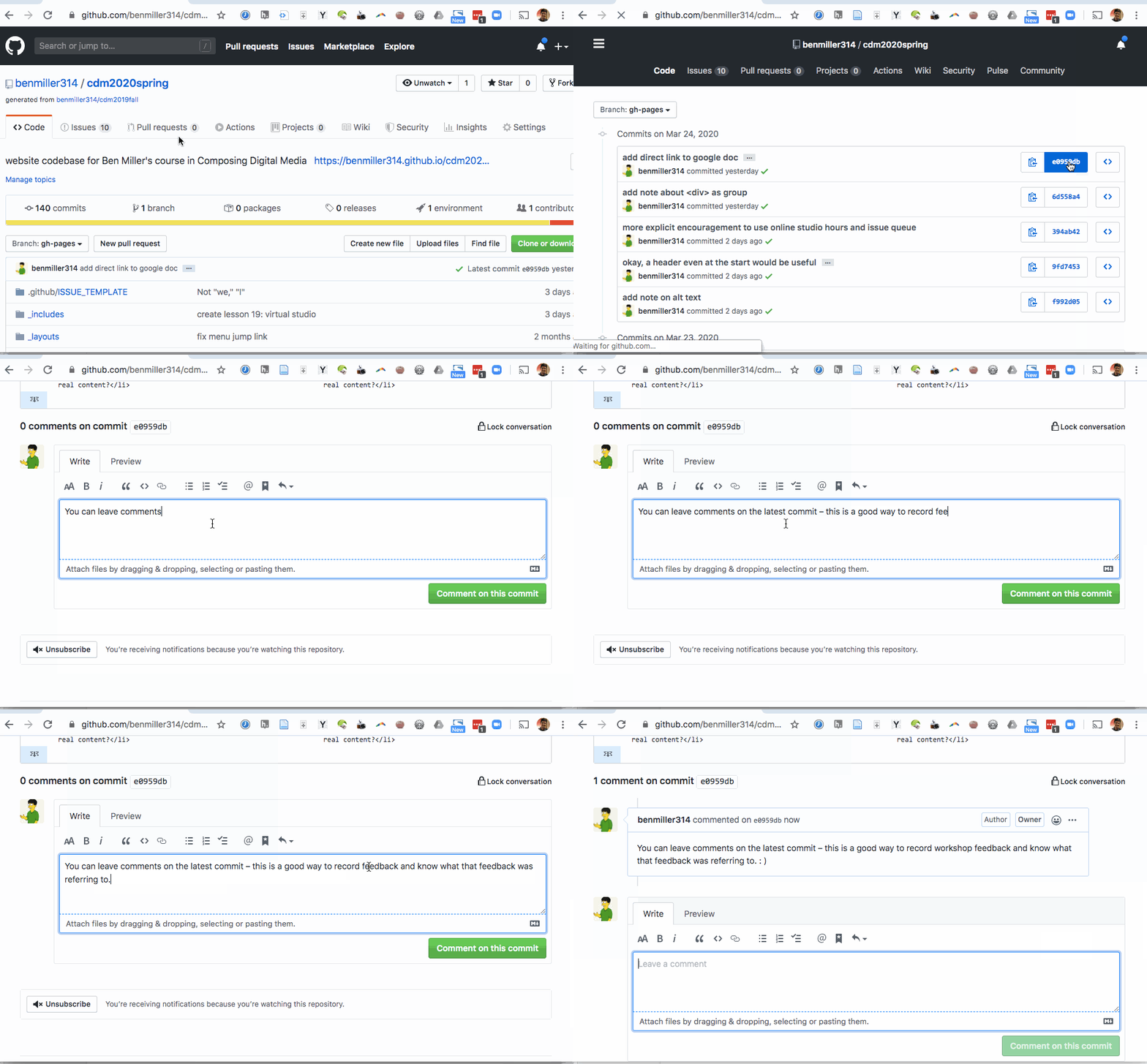
- Finally, make sure you post all these comments – in language you’d be comfortable sharing publicly – on the latest commit on the project’s GitHub website. Here’s how and where to leave comments on GitHub: Just
- click through to the history of commits (the clock page);
- click on the commit hash, the set of random-seeming numbers and letters almost at the end of the top row (i.e., for the most recent commit); and
- scroll to the bottom of the diff view that appears. You’ll see a comment box there:

- Repeat the steps above for your next two partners’ repos. On subsequent loops, note that after viewing the project first, you may also want to read and/or refer to the previous comments.
Your Groups
Within each group, you’re responsible for commenting on the three people listed after your name; if that takes you to the end of the line, wrap around. (e.g. Alexa will review visual arguments for Christianna, Carly, and Kyle O; Christianna will review for Carly, Kyle O, and Leia; Carly will review for Kyle O, Leia, and Alexa; and so on.)
- Alexa, Christianna, Carly, Kyle O’Malley, Leia
- Brian, Lydon, Lucas, Hunter, Shreya
- (async group): Ben Schatz, Kyle Maxwell, Jagr, Kevin
I’ll help keep track of time, but you may well want to set your own timer.
5. Evaluation revisited (10 min)
If you finish early and are waiting for your classmates, first take a minute to reread the comments you just gave: can you tell from your description what the image contains / conveys, or do you assume someone else is looking at it?
If you’re satisfied, reflect in your own notes on this process: did it help you realize anything about the criteria, or about your own project, or about data writing more broadly? Did it raise any new questions?
If you want to share any insights, I’d love to hear them! Since we likely don’t have time to talk it through, you can add (and probably anonymously) to the shared google doc.
EXT: Studio
If you finish the above and are still waiting for the rest of us, (a) view any new comments on your own project, and (b) use what class time remains to make a revision plan – or even begin the revision now. As in past lessons, it would help me get a sense of how things are going (since I can’t check in face to face) if you could write your studio goals in the shared doc. Thanks!
Homework for Next Time
- Next class will be a graphic designers’ studio: bring whatever you need to work towards finalizing your visual argument / rhetorical collage.
- The final draft is due at the end of the day on Sunday, and a reflection by class-time on Tuesday; see the rhetorical collage prompt for further details.
- Even as we zoom in toward the unit finale (again!), I want to keep one eye open toward the bigger picture. Write a short blog post thinking about possible group projects you’d like to try for the end of term.
- What further possibilities of graphic design might you want to explore in connection with other people, and other media?
- You can post this to the Issue Queue; there is no minimum length requirement, but it’s a good opportunity to shape the final unit to match your interests!
EXT:
If any time remains, go ahead and get started on those revisions!