Web unit virtual studio
Work to have done:
- Progress in the html + css tutorial, up to the section on semantic html
- Work in pursuit of a full-draft website that meets baseline criteria
Plan for the day:
- Welcome back (and important links)
- Website construction: seeds of revision
- Set an intention
- Studio time!
- Exit note
1. Welcome back (and important links)
Welcome back, everyone – if your last two weeks have been anything like mine, they’ve been full of anxious news-reading, rebuilding in the wake of disrupted plans, and what one professor I used to work with called “Forced Family Fun.”
I’m expecting a certain amount of flexible asynchronicity to the lesson plans moving forward, so adjust to the time you have available. That said, I also want to maintain a few online spaces where we can feel connected to one another:
-
My online office, for the duration of the semester, will be at https://pitt.zoom.us/j/4969331343. Barring homelife interruptions, I’m going to try to have that room open whenever class would be in session, plus my office hours on Wed/Thurs from 12-1. Please come find me there during today’s studio hours! I’m happy to help where I can, and screensharing is often really useful.
-
The google doc that we’ve been using for shared notes, at http://bit.ly/cdm2020spring-criteria, will have new spaces where I’ll ask you to check in briefly at the start and end of your own personal class time, mainly during studio days. (See below for some prompts.)
-
And of course you can also find each other on GitHub, including on the Issue Queue and the links from there to your various repositories. Filing a help request on the issue queue will be one of the best ways to make sure I help answer your questions: it’ll help me keep track of what I’ve responded to (and what I haven’t), and it’ll prompt you to give me the info I need to respond more swiftly (like screenshots and links).
2. Website construction: seeds of revision
Today is all about working on your individual projects! Add and mark up content, adjust layout, watch relevant tutorials. I know your lives are busy, especially now; hopefully you have a space and time when you can get free from other distractions and obligations to move your composition forward.
Here are some cross-project ideas to think about as you engage with the particulars of your own:
You should have an index.html (or index.md)
By default, this is what a web browser will display when you just type in the URL of your website: it is, in other words, the default filename for your home page. If your home page currently has another filename, you probably want to change it to index.html. You can always keep your more interesting name as the <title>!Don't forget to have alt text for your images
Text-alternatives, which you add to images using<img alt="text description here" src="path/to/source.jpg">, are a required element in validated html. They're also really helpful, and not only to blind users: they make the html file more readable on its own, and thus more semantic, and they help you troubleshoot layout when image paths are broken by showing you where each image is trying to appear. For more guidance on how to write useful alt text, see https://webaim.org/techniques/alttext/.
Don't forget to update your README.
This is what GitHub Pages will display if you don't have an index file, but it's also a kind of cover letter for your code. The README should have a brief description of the project, and may I also suggest an active link to your live website, if you have one?Aim for semanticity: structure in the HTML, display in the CSS.
If you have hard-coded display using HTML elements like <center>, <font>, or <b>, or if you have inline style set with the "style" attribute on individual elements, I encourage you to look for ways to do this instead with CSS. This is a matter of both flexibility and accessibility, and it makes it a lot easier to revise if you later decide to, say, change your color scheme: you just have to change one line in the CSS, rather than search for every explicit tag.
For some things, this separation even makes it easier to decide what you want: you can play with the CSS rules (and select colors!) directly in the browser's inspector, and then grab what you want. Firefox is especially user-friendly for this. See last class's lesson plan (wow, that was a long time ago) for a gif of what this might look like.
Stuck on layout? Try CSS grid.
I assigned a great Medium post introducing the reader to CSS Grid as homework after lesson 17, but it's probably worth revisiting now that you've had a little more experience. The latest CSS approach to layout, Grid is new enough that it's not in the "Interneting is Hard" tutorial, but old enough that it's now has almost universal browser support.
What I like about this particular tutorial – just a 7-minute read, the header helpfully informs me – is that it's embedded not only with images, but with short screen-capture GIFs that demonstrate in a very immediate way what happens to the layout when a new CSS rule is added.
Author Rafaela Ferro also does a great job of keeping the tone light by focusing on cute pictures of dogs. I also recommend her follow-up tutorial on using CSS Grid to create responsive layout – which is, she argues, even easier to do with Grid than with Flexbox (let alone Float).
Take the lowest line-count challenge.
In the HTML, consider whether you need all the <div>s you have, or whether you could put the relevant class directly on the element inside it. (You might well need the container for flexbox or grid layout.) The way I think of <div> is that it groups together several items, kind of like the "group" button in PowerPoint or the layer-groups in GIMP: if you only have one thing inside a <div>, you probably don't need it.
In CSS, look for ways to consolidate rules to avoid repeating yourself. For example, any style you need to apply more than once should probably use a class selector that you can re-use several times in your HTML, rather than an id (which you can only use once).
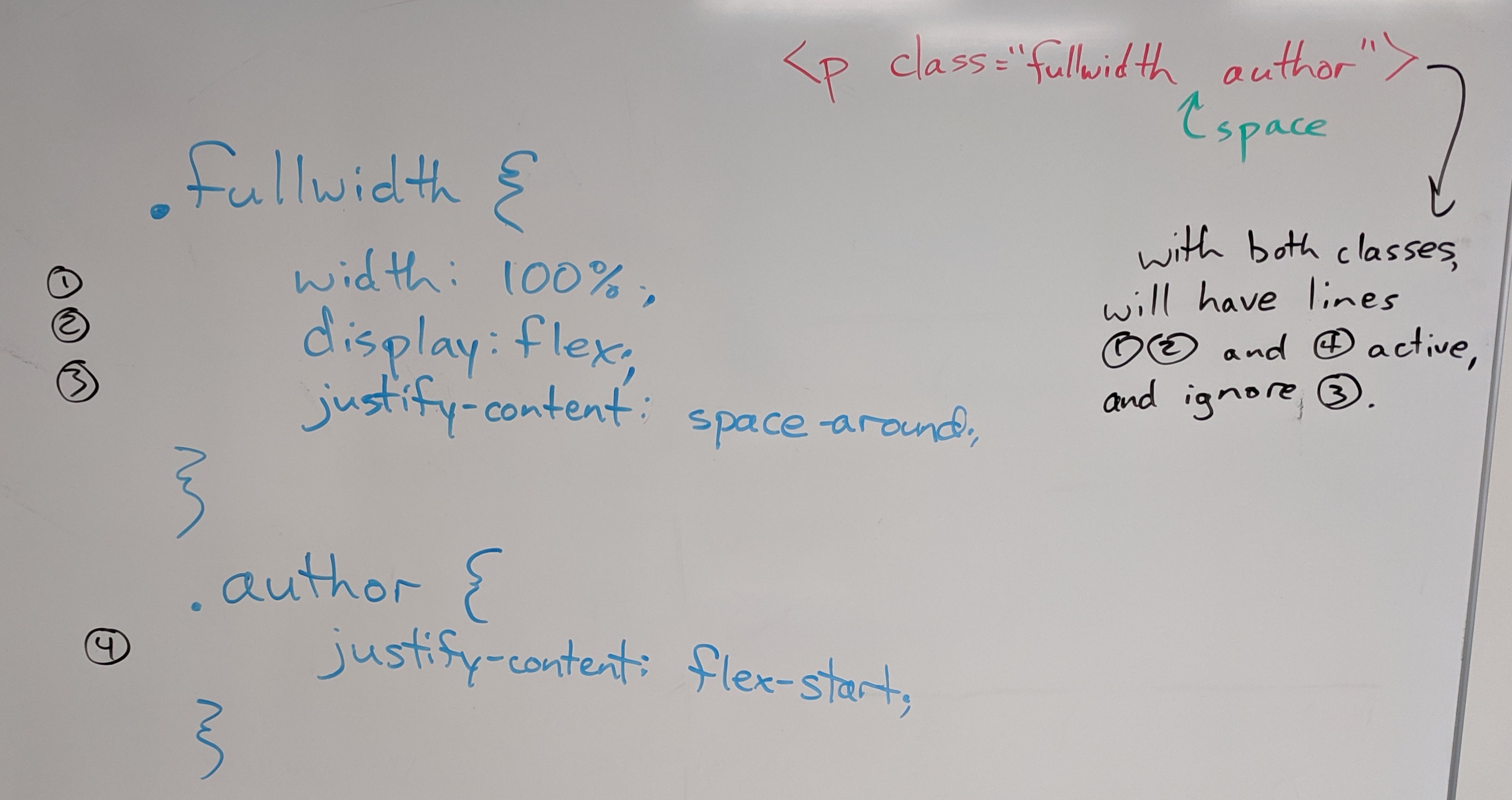
Bear in mind that the cascading aspect of CSS means you can combine rules, so you can define a general class for (say) images and then add or override just one or two lines for a subclass:

Rules at the same level of specificity will be applied in the order they appear in the CSS, so later rules override over earlier ones.
3. Set an intention
- Work on responsive layout?
- Work on replacing placeholder content with real content?
- Work on streamlining your code?
- Work on one of your stretch goals?
- etc etc
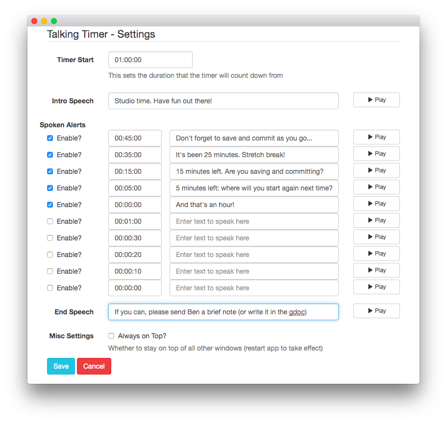
We’re doing this asynchronously now, so I can’t keep track of your time… but I can recommend a Chrome app that will simulate the effect:

I’m sure something similar exists if you’re not a Chrome user; I found this one pretty quickly on Google.
- as a project file
- as a git commit, saying what you've just achieved
- as a screenshot
Quick report back
Before you leave, just as a way for me to check in, I’d like to hear more about what happened today: did you find images? Level up on a particular CSS skill? Decide something about your project? Raise a question in a new way that you’d like some help with?
Head back into the google doc and reply to your intention-post. You could email me directly if you prefer, but I’m hoping some of your insights or achievements will help inspire others.
Homework for next time
- Before Thursday at 10am, push a full draft of your website to GitHub. Your repository should include:
- A multifile project folder (probably called “docs”), containing a combination of html, css, and image files
- At least one more static screenshot (.png or .jpg) of your web pages in progress.
- Think about what moments are worth remembering as you go: where did you level up, or realize something, or get stuck?
- An updated assets or credits file reflecting what you actually used, including attribution of any outside sources and your permission to use them (e.g. explicit licenses like CC, or rationales for claiming fair use)
- If you want, this can be a live page (or a footer) on your website.
- An updated README.md file introducing your website to a new audience. Make it something to live beyond this assignment, if you can. :¬)
- Because we’re working remotely, it’s essential for Thursday’s workshop that your repo be in clonable condition. You can check by cloning it again yourself to a different location on your computer: if you can open the files in that new location without a problem, you’re good to go. (And good as well to delete your duplicate copy, before you forget which files you were updating.)
- If you’re unable to use GitHub right now (because of tech access or other challenges of our new world order), please email me as soon as you can, so we can work something else out.
- I’ll let you know by Thursday morning which repos you’ll be responding to, and on Thursday’s lesson plan I’ll have instructions for how to comment.
Thanks for bearing with me through these weird working conditions, everyone!