Web Unit Workshop
Work to have done: a solid attempt at a complete website, ideally meeting baseline criteria. Rough edges are still welcome.
Plan for the day:
- Workflow tweaks for websites and for #CovidCampus (5-10 min)
- Evaluation reminder: our shared criteria (5 min)
- Peer review workshop (3 times 10-12 min)
- Evaluation revisited (10 min)
- HW preview
- EXT: Studio
Workflow Tweaks
We can’t trade cards, so we’ll trade clones
The most obvious change is that you can’t very well load your website files on your own computer and switch seats with a neighbor. Instead, I’m putting the 19 of you into four groups: within your group, you’ll clone three repositories, and leave feedback for the authors on GitHub.
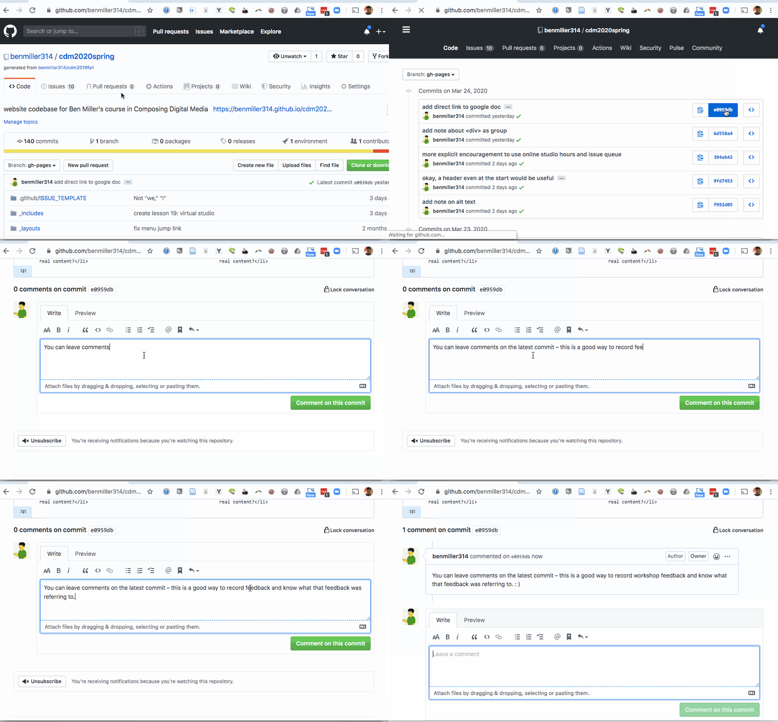
Here’s how and where to leave comments on GitHub: Just (1) click through to the history of commits; (2) click on the commit hash, the set of random-seeming numbers and letters almost at the end of the top row (i.e., for the most recent commit); and (3) scroll to the bottom of the diff view that appears. You’ll see a comment box there:
Still describe -> evaluate -> suggest… but describe twice
As you remember from the sound and image units, I encourage you to always start by describing the piece, before judging what’s good about it, so the creator knows whether you’re on the same page. (Which is itself important feedback: is my message getting through?)
- First look at the HTML files, and say back what you see there. What seem to be the major content areas? What's given top-level focus? (e.g. what kind of things are getting their own pages, or what's at <h1> status within a page?) What's next in the hierarchy?
- Once you've done that, turn to the browser and repeat the process for the display. What's given visual weight? What falls "above the fold"? Where are you invited to go next?
From there, you can continue on to evaluation, using the shared criteria we developed before the break – and also the correspondence between the hierarchy you observed in the HTML and the hierarchy you observed in the rendered site.
NB: This is still a form of description: it’s not about “good” or “bad” in the abstract but about where it meets or misses the shared or stated goals.
Finally, in your suggestions, some revision possibility that you think might help take the project to the next level: assume this is a work in progress. Given the goals, the focus, the criteria, what might be next?
2. Evaluation reminder: our criteria (5 min)
We set up a few shared goals and constraints to meet the baseline requirements. Let’s try to help everyone get at least to there!
3. Peer Review Workshop (3 times 10-12 min)
Let’s do this!
Your groups
Within each group, you’re responsible for commenting on the three people after your name; if that takes you to the end, wrap around again. (e.g. Jake will review sites for Linda, Olivia, and An; Linda will review for Olivia, An, and Hailey; and so on.)
Groups:
- An, Hailey, Jake, Linda, Olivia
- Angeline, Hannah, Kat, Kosha, Ryan
- Blake1, Dilan, Matt, Jeremy
- Brahler, Emma, Kevin, Michaela, Sydney
1 Wrote to tell me they might not be able to participate in workshop due to scheduling challenges; if you need an extra set of eyes by tomorrow morning, please let me know!
Timing note
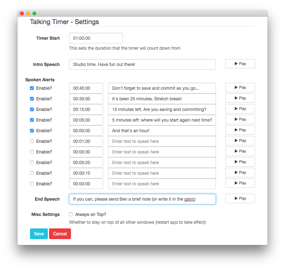
Detailed instructions for workshop-at-a-distance
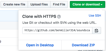
- Go to your first partner’s website, and use the “clone or download” button, probably with the “open in desktop” option.
- In order to avoid name conflicts, you’ll want to append your partner’s name to the name of the Local Folder (thanks, Linda, for this tip!)
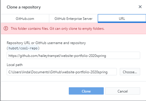
- In order to avoid name conflicts, you’ll want to append your partner’s name to the name of the Local Folder (thanks, Linda, for this tip!)
-
In GitHub Desktop, choose the “Open in Atom” option if available, or else use View in Finder (Mac) / View in Explorer (PC) to find the files you just downloaded, and open them in your text editor.
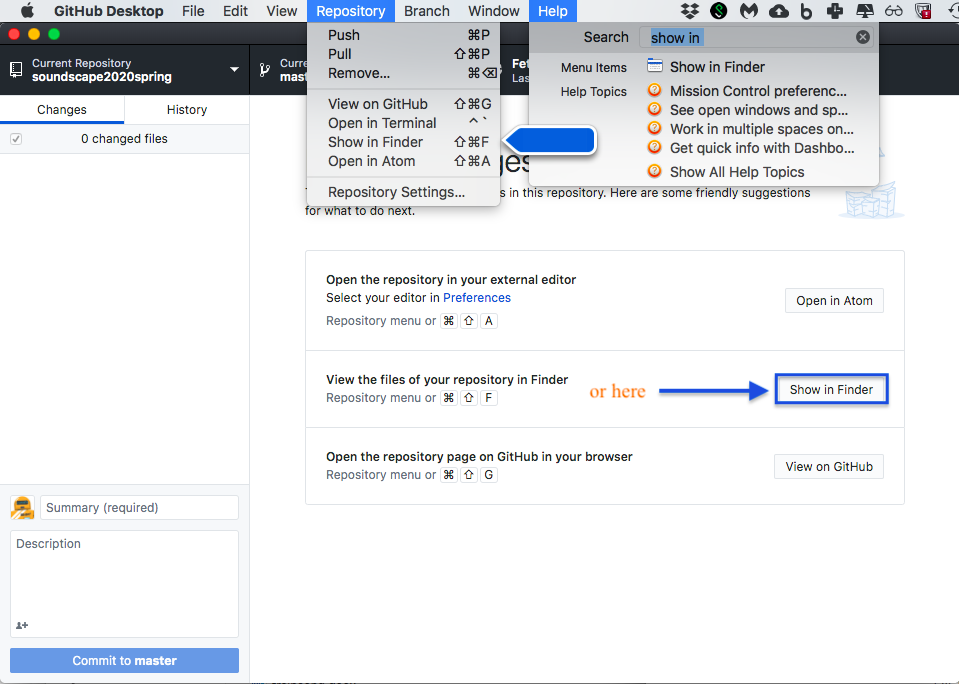
- Start by viewing the HTML in the docs folder (or, if the main files aren’t there, look for something that signals it’s the real project and not an exercise). Do the first part of Describe: What seem to be the major content areas? What’s given top-level focus? (e.g. what kind of things are getting their own pages, or what’s at <h1> status within a page?) What’s next in the hierarchy?
- If you’re seeing a lot of curly brackets, or there’s a subfolder called “_layouts”, this may be a Jekyll site, which means the HTML will be distributed in a bunch of places. Hopefully there are instructions or a link to the fully-rendered site; once there, you can right-click to View Source, and see the composite HTML that way.
-
Next up, load the site in your browser (Firefox is best for inspecting the CSS of individual elements, should you want to; Chrome is also pretty good), and describe again: What’s given visual weight? What falls “above the fold”? Where are you invited to go next?
-
Now continue as usual: evaluate the site relative to the shared set of criteria, and suggest changes that you think would take it to baseline and/or above.
-
Finally, make sure you post all these comments – in language you’d be comfortable sharing publicly – on the latest commit, as shown at the beginning of this lesson plan.
- Repeat the steps above for your next two partners’ repos. On subsequent loops, note that after viewing the project first, you may also want to read and/or refer to the previous comments.
4. Evaluation revisited (10 min)
Based on your viewing, if you’d like to propose changes to the baseline criteria, or add new aspirational goals to consider, please comment on the google doc!
Homework for Next Time
- Next class will be a web designers’ studio, like this past Tuesday’s: I’ll be on Zoom during class time (2:30-3:45) to field questions or just to check in.
- The final draft is due at the end of the day on Tuesday night, 3/31, and a reflection by class-time on Thursday, 4/2; see the prompt for further details.
- Next Thursday, we’ll kick off our modified “consolidation unit” with some games and some reflective/generative writing: reread my email and start thinking about what you might want to do.
EXT:
If any time remains, go ahead and get started on those revisions!