Visual Unit Workshop
Work to have done: a solid attempt at a complete visual argument, ideally meeting baseline criteria. Rough edges are still welcome.
Plan for the day:
- Workflow Reminder: Describe -> Evaluate -> Suggest (5 min)
- Evaluation reminder: our shared criteria (5 min)
- Peer Review Workshop (3 times 10-12 min)
- Evaluation revisited (10 min)
- HW Preview
1. Workflow Reminder: Describe -> Evaluate -> Suggest (5 min)
Like last time, I’d like you to use a workflow that, first and foremost, helps you see what’s already happening.
It takes practice; not all of you were really using it last time (though most were! Thanks!). Please do try: it helps make your comments more concrete and actionable. It’s great to like something, but if you can’t say what you liked, the creator can’t build on that knowledge as effectively… and you may not be learning as much as you could by naming what you value.
A good test is whether you can tell, just from your comment, what you were reacting to.
To help maximize what you learn both in receiving and in giving feedback, please work in the following three steps:
- First describe what you see. Where do your eyes go first? What do you think is the main point your partner wanted to get across?
- Then evaluate where it meets or misses our shared criteria. NB: This is still a form of description: it's not about "good" or "bad" in the abstract but about where it meets or misses the shared or stated goals.
- Finally, suggest ways to meet and exceed the criteria. Let's try to help everyone get at least to baseline! NB: The idea is suggestion, not commands: aim for a friendly tone. (And remember to also interpret these that way, whatever their tone seems to be.)
2. Evaluation reminder: our criteria (5 min)
After last class, I integrated your suggested goals and constraints in our notes doc. Let’s just look at these together briefly, to make sure there are no surprises.
Can we go alphabetically through the Participants window, reading aloud, one bullet each? (Ask questions, if you have them, as we go.)
Baseline criteria For a minimum grade of B, all projects for this unit must:
- Use arrangement, size, color, visual rhythm, and/or contrast to focus and guide viewers’ attention.
- Have a clear message or intervention that you can articulate
- If including words, choose a font that matches the style/tone of your piece
- If not using words, clarify your message and this choice in the reflection
- Credit all assets correctly, including attribution (creator names) where required
- Use at least 3 layers
- Use at least 1 tool beyond select, move, and text
- Use the reflection to clarify your compositional choices and goals (e.g. design hierarchy)
- Use meaningful commit messages that say what’s changing (and maybe even why)
Aspirational inspirations To target (but not guarantee) a grade above a B, the best projects for this unit may…
- Organize your files through layer labeling, layer groups, repo structure
- Use more than 3 distinct overlapping layers
- Use more than 3 tools beyond select, move, and text that are new to you
- e.g. Collaborate with the machine by using automated tools/filters/effects (gradients, blur, etc)
- e.g. Use layer masks / blend modes for non-destructive extraction, saturation, cross-fades, etc
- Alter part of a source image by compositing it with another image to change its meaning (see, e.g. the globe as ice cream, pillow as pill, ketchup as tomatoes, ocean as carpet)
- Create your own visual assets through photography, scanned or born-digital drawing, etc
- Demonstrate through feedback that someone looking at your piece can accurately articulate your message/argument
- Demonstrate through feedback that someone looking at your piece can accurately describe your intended audience
- Try to make your design more accessible, e.g. through dyslexia-friendly fonts, color palettes designed for people with colorblindness, high contrast for people with visual impairments, etc
- Use multiple design strategies in ways that compliment each other (whether to reinforce a single shared focus or to add nuance / surprise down the hierarchy)
- Refer to assigned readings in explaining your design choices, e.g. font pairings, hierarchical levels, etc
- Be bright and bold to make your work pop and draw the eye
- Be subtle and crafty to make your work reveal itself only gradually
3. Peer Review Workshop (3-5 min setup, plus 10-12 min for each of 3 partners)
Detailed instructions for workshop-at-a-distance
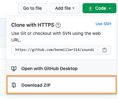
- Go to your first partner’s repo on GitHub, and use the green “Code” button. If you have a fast connection and lots of disk space, you can clone (e.g. with the “Open with GitHub Desktop” option); otherwise, you might be better off using the Download ZIP option.

- should be faster than cloning, because it leaves out the history of changes (which you can still find on GitHub)
- shouldn’t cause conflicts with your own repository
- still, you may want to add your partner’s name to the file/folder’s name, just to be safe
- Unzip the folder to view the files. (Windows users have the option of viewing the contents of the compressed folder, but it’ll work much better if you decompress first.) Find and open the .xcf (GIMP) file, or – if your partner’s not using GIMP – the .psd (Photoshop) file. Use the README to guide you if there are several.
- If you need to zoom out quickly to fit the whole image, try
Ctrl+Shift+Jin GIMP, orCtrl/Cmd+0in Photoshop.
- If you need to zoom out quickly to fit the whole image, try
- Here’s where the cycle really starts:
- describe the visual argument you see. What seems to be the top-level focus? What’s next in the hierarchy? Can you say back the argument/claim/intervention? Help your partner learn how your eye is drawn.
- evaluate the project relative to the shared set of criteria, and
- suggest changes that you think would take it to baseline and/or above.
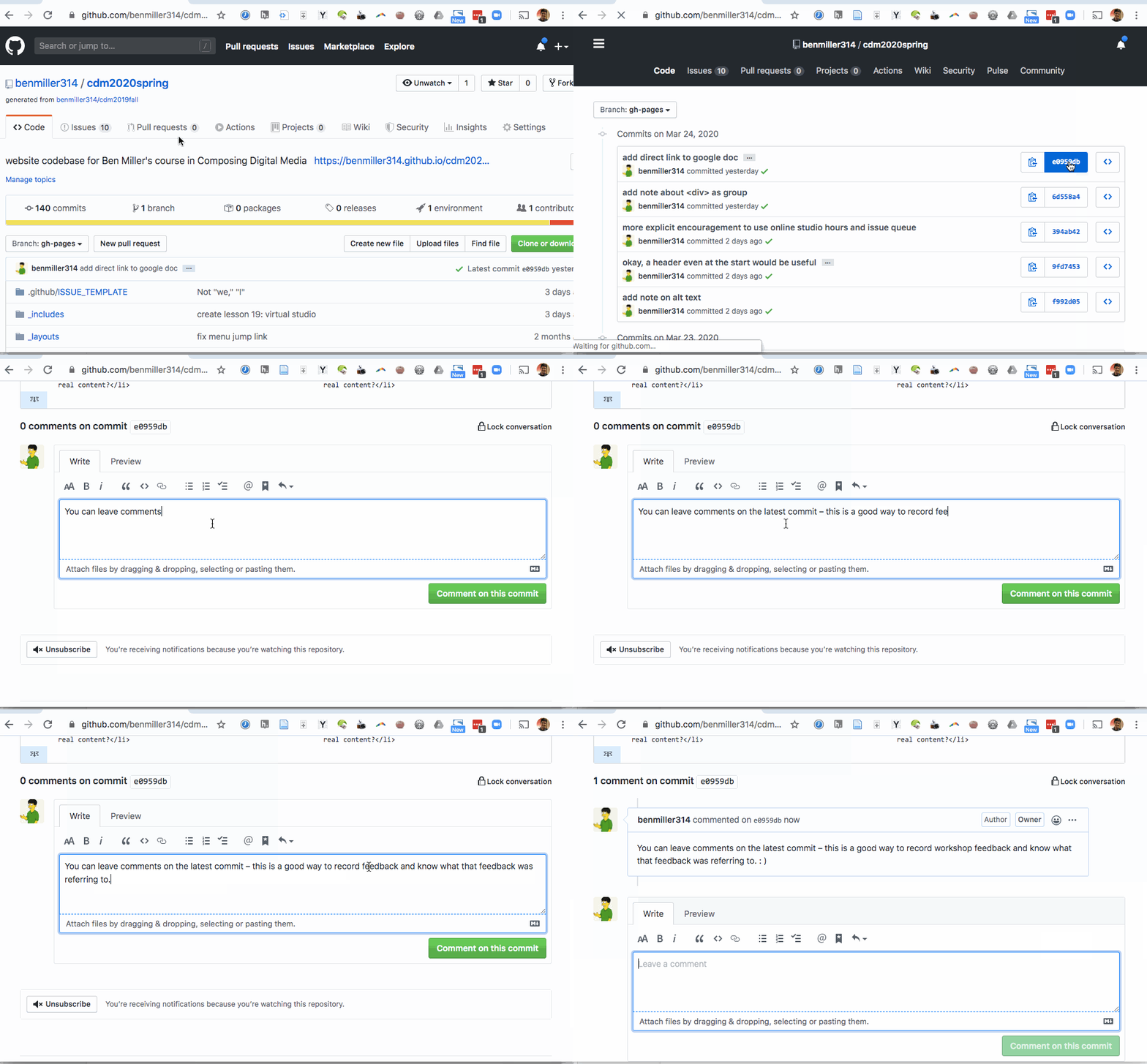
- Finally, make sure you post all these comments – in language you’d be comfortable sharing publicly – on the latest commit on the project’s GitHub website. Here’s how and where to leave comments on GitHub: Just
- click through to the history of commits (the clock page);
- click on the commit hash, the set of random-seeming numbers and letters almost at the end of the top row (i.e., for the most recent commit); and
- scroll to the bottom of the diff view that appears. You’ll see a comment box there:

- Repeat the steps above for your next two partners’ repos. On subsequent loops, note that after viewing the project first, you may also want to read and/or refer to the previous comments.
Your Groups
Within each group, you’re responsible for commenting on the three people listed after your name; if that takes you to the end of the line, wrap around. (e.g. Tori will review visual arguments for Greg, Noah, and Anna; Greg will review for Noah, Anna, and Mason; Anna will review for Mason, Grace H, and Tori; and so on.)
NB: If one of your partners has not yet posted a draft, reclaim that time for an EXT: Studio, but try (if you can) to loop back later this week: we’re trying to accommodate Flex@Pitt.
- Tori, Greg, Noah, Anna, Mason, Grace H
- Rutendo, Patrick, Jackie, Payton, Kenzie, Trent
- Thomas, Caela, Garrett, Maggie
- Grace D, Carolyn, Abby, Reaia
If you're participating asynchronously, please try to complete your review by the end of Saturday night, so your partners can have some weekend time (when most of you said you have more time to work) with your feedback in mind. Friday would be even better.
If that's just not possible (and I understand how that might be the case), let me know asap and I'll make sure the others get my feedback in the meantime. Monday night is about the latest it might still be helpful, so that's the official async participation deadline; just confirm that you've pulled the latest version whenever you start.
I’ll help keep track of time, but you may well want to set your own timer.
5. Evaluation revisited (10 min)
If you finish early and are waiting for your classmates, first take a minute to reread the comments you just gave: can you tell from your description what the image contains / conveys, or do you assume someone else is looking at it?
If you’re satisfied, reflect in your own notes on this process: did it help you realize anything about the criteria, or about your own project, or about digital composing more broadly? Did it raise any new questions?
If you want to share any insights, I’d love to hear them! Since we likely don’t have time to talk it through, you can add comments or suggestions (or anonymous notes) to the shared google doc.
EXT: Studio
Use what class time remains to make a revision plan – or even begin the revision now. As in past lessons, it would help me get a sense of how things are going (since I can’t check in face to face) if you could write your studio goals in the shared doc. Thanks!
Homework for Next Time
- If you weren’t able to finish responding during class, I hope you can do so on the asynchronous schedule above. I’m not expecting or demanding extensive notes (remember, I used to do this with index cards), so be kind to yourself as well as to your workshop partners.
- If you haven’t received three comments by the weekend, please email me, and I’ll be your extra respondent.
- Next class will be a graphic designers’ studio: bring whatever you need to work towards finalizing your visual argument / rhetorical collage.
- The final draft is targeted for the end of the day on the following Sunday, and due with a reflection by class-time the following on Tuesday; see the rhetorical collage prompt for further details.
- Even as we zoom in toward the unit finale (again!), I want to keep one eye open toward the bigger picture. Write a short blog post thinking about possible group projects you’d like to try for the end of term.
- What further possibilities of graphic design might you want to explore in connection with other people, and other media?
- You can post this to the Issue Queue; like last time, there is no minimum length requirement, but it’s an opportunity to help shape the final unit to match your interests!