Visual Unit Studio 2
Work to have done:
- An optional short blog post about possible consolidation-unit projects
- Work in pursuit of a final visual argument / rhetorical collage
Plan for the day:
- Guiding thoughts for Studio (5-15 min)
- Set intentions
- Work in breakout rooms
- Exit note
At the same time, it’s worth noting that you’re working in a shared space, in a studio. If you have questions, or you want feedback on something, you have your classmates and your instructor on-hand.
I’ll make pomodoro timers optional but encouraged again: I can’t be in every room, so it’s good to check in every so often with the clock and other viewers.
Guiding thoughts for Studio (5-15 min)
Some seeds of revision possibilities I want to plant, based on seeing the latest drafts (as of last night):
Help your text pop.
If you have text on your image, it can be tricky to get it to stand out against the background. Luckily, in a digital medium, we can collaborate with the machine to get some automated help. Play around with drop-shadow, or even the Xach effect – a quick-hit combination of highlight and drop-shadow – as explained in this tutorial. NB: this works by adding two new layers (a shadow, and a highlight), one of which is masked; you can change the order of layers to affect only the ones you want.
There are lots of websites with more advice on drop-shadowing, so I recommend searching around for examples. Some key points:
- The goal is contrast, so pick a color that's not too close to your text color – you especially want to change the luminance of the shadow relative to the text. Try giving the brighter color a luminance at least 4.5 times that of the darker color.
- A little blur works better on image backgrounds than on solid backgrounds where it's more noticeable.
- Drop-shadow works best on headlines, and less well on body text. If you need it everywhere, try going minimalist.
Or just reconsider whether that text needs that background. Some have argued that drop shadow is a "bandage" for bad design: that the real solution is to rearrange the layout so there's more contrast to begin with. Not always doable, but still: food for thought!
Consider naming and/or grouping your layers.
GIMP doesn't let you select multiple layers at a time, but there is a workaround: as in PowerPoint, you can group objects (layers) together, and then move (or modify) the group as a unit. See docs.gimp.org/en/gimp-layer-groups.html. (Photoshop does let you select multiple layers, but it also lets you group them – and it's not a bad idea, both as a shortcut to selection and as a clear visual indication of which layers ought to be affected together.) Note the opportunity to then further organize your workspace with good naming practices!Consider how alignment, enclosure, and proximity signal association.
Psychologists studying perception have identified many principles of grouping: the means by which humans interpret disparate visual stimuli as part of a single object – more or less automatically. We've seen some of these at work already in thinking about proximity and color, but it's worth thinking about how to use these principles to communicate a shared level of attention, rather than for dominating a hierarchy.
For example, when objects' edges align, most viewers will treat them as related; when they share a color, we'll do the same; even when a line is discontinuous, but it matches a simple shape we recognize, we'll automatically try to fill in the missing pieces and see it as a single whole.
You may already have read about this in an optional assignment at the start of the unit, but you'd have to have gone past the first link I gave you to reach this page on visual perception, and then gotten through the text explanation to some visual examples. Those are still great readings, and I highly recommend them! But if you're in the market for a quicker introduction, you might like these examples from user experience (UX) design, which also gesture toward the web unit we'll start next week.
Have a lot of content? Not sure where text could fit? Consider panels or frames.
This is related to the Gestalt principle of common regions. Much as a comic strip uses boxes to indicate a sequence of connected moments in time, you can divide your canvas into distinct areas, which can provide breath and space while preserving movement. There are several ways to define your areas: with distinct blocks of background image, color, or pattern; with a semi-opaque layer of white or black, acting like frosted glass over the layer below; or with positive-space images that cut between one chunk of the image and another.
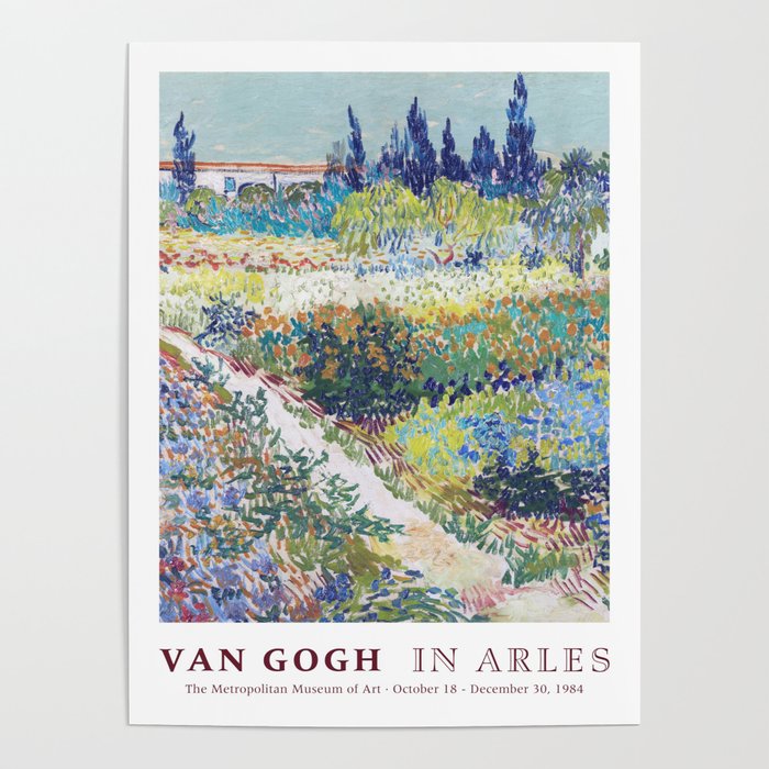
The same approach can also give you the effect of a museum poster, where the main image is framed as a single panel, with an off-image description delineated by a full-width rectangle (or full height, for a sidebar) of contrasting background. (Solid white or solid black often work well to signal "I'm not the image.") This technique can be useful for adding a clarifying slogan or title to an image, without messing up your existing design hierarchy.
Consider pointing viewers toward a follow-up.
Many of you are trying to get viewers to take an action; if you haven't yet, consider giving them a place to go to get involved, or to get more information. Make this link large enough to be easily readable, even though it probably won't fall at the top level of your visual hierarchy (because it makes more sense as the last thing, rather than the first thing, they see). Some of you are already doing thisr, which is awesome!
Even if you don't have such a call to action in your visual argument, you might want to add an unobtrusive link to your credits file on GitHub – e.g. in a small font-size along the border. This would serve as a compromise between filling a sidebar or footer with all the required attributions for your Creative Commons images (though that may be fine, too) and not actually making those names available – which would be a violation of the CC-BY and related licenses.
NB: A link shortener like bit.ly or ow.ly may help to keep this kind of link subtle enough to not detract from your design. If you create a login, you can even customize the link.
Don't forget your README – and consider adding a title there.
A title can provide a context, a clue, a genre, a commentary; it can add an extra layer to viewer expectations. What will you call your collage? Not sure where a title would go? Think of placards in museums: alongside the image is pretty common. You can put the title in your README. Sometimes the title is obvious from the image itself; sometimes it's not. Likewise, ad campaigns often have titles, even if they're not referred to in the ads themselves.Okay, now go to!
As usual for studio time, please set a daily goal in the shared notes doc, both for accountability and so I can look for ways to help.
- as a project file
- as a screenshot, showing your process
- as a git commit, saying what you've just achieved
EXT: Feel like your project is finished, and not sure what to do?
- Make sure everything’s pushed properly to GitHub
- Make some lists: things I have learned about GIMP/Photoshop/fonts; questions I have about GIMP/Photoshop/fonts; things I have learned about gestalt principles of perception; questions I have about gestalt principles of perception.
- Work with the Internet, or peers, or me to answer the questions from step 2.
- Write a draft of your reflection; remember that you still have time to revise, though.
- Have a look at what your classmates have posted to the issue queue, looking forward to the integration/consolidation unit. Anything you’re excited by? Anything you want to add?
Quick report back (with 5 min left)
Just as a way for me to check in, I’d like to hear more about what happened today: did you find images? Level up on a particular GIMP skill? Which ones? Decide something about your project (what was it)? Raise a question in a new way that you’d like some help with?
Take five minutes to reply to your own notes in the doc. If everyone finishes early, we can hear from a few volunteers out loud.
Homework for next time
Next class will be a moment of pause for reflection on the course as a whole, what’s working, what you’d like to do more or less of. I’ll ask everyone to speak at least once.
Other than that, we’re looking ahead:
- You should already have done this, but just in case: if you don’t already have a syntax-highlighting text editor you prefer, please download and install the Atom text editor. We’ll be using it for our upcoming web design unit.
- Aiming for 11:59pm on Sunday, complete – at least for now – your visual argument / rhetorical collage. Your repository (on GitHub or in a shared Box folder) should include:
- Your most up-to-date layered project file (.xcf for GIMP, .psd for Photoshop)
- A series, now, of screenshots showing your GIMP project in progress
- An exported flat image (.png or .jpeg), for speedy previewing or as a backup should something go wrong with the project file
- An updated ASSETS.md (or CREDITS.md) file reflecting what you actually used, including documentation of any outside sources and your permission to use them (e.g. explicit licenses like CC, or rationales for claiming fair use)
- An updated README.md file introducing your collage to a new audience. Give your piece a title! Make it something to live beyond this assignment, if you can. :¬)
- By Tuesday’s class, write a prose reflection that incorporates images from your feedback and screenshots of your GIMP project. As explained in the prompt for the assignment, this should include:
- At least 500 words
- Your own assessment of how you met the baseline criteria and goals for the unit, as well as any aspirational goals as appropriate
- At least one screenshot or blockquote of feedback you used (and please say how)
- At least one or two screenshots of your work in progress (ideally, related to the discussion in the previous two bullets)
- Post your reflection to the course site’s Issue queue, to make it easier to embed images.
- If you want to then copy the source code into a file in your repo called reflections.md, I won’t stop you!
- If you feel strongly that you’d rather keep your reflection private, you can email it to me instead. But my default assumption is that we learn from each other as much as from ourselves, so I hope you can find a way to write publicly about your experience with this project.